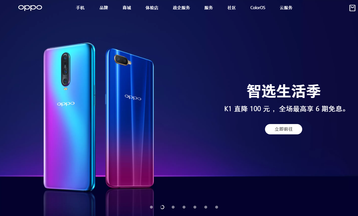
OPPO seems to be quite busy recently, working on its upcoming OPPO Reno series with its 10X Zoom camera. The company unveiled the series earlier today, but alongside that reveal, the company also seems to have made some changes to its logo. While we are not quite sure when the logo change came into effect, the official OPPO website in China has a brand new logo.
The new OPPO logo is much simpler and consistent in design. Each character is of equal thickness, unlike the old one. Personally, I like the new design, mainly because it has a modern look. However, it does come out a bit too safe and won’t stand out like the old design.


At present, the new OPPO logo is seen only on its official Chinese website. All other regional websites like OPPO India or OPPO Global sites are still using the old logo. So, we are not sure whether the company intends to limit its use to China or whether it’s going to update it globally. Anyway, we hope to hear more from the company soon.
Until then, let us know whether you prefer this new logo or the old one.


