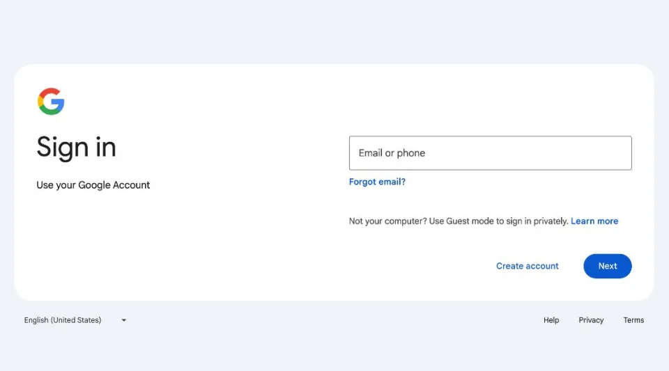
Google has started to roll out a fresh look for its sign-in and sign-up pages. To be honest, the change isn’t huge, but for anyone who logs into Google services often, it’s a nice little update. Basically, Google has tidied up the design a bit. This new design hasn’t changed how anything works, but it’s part of Google keeping things looking modern.
These pages are a part of Google’s ‘Material Design’ UI, released in 2014
The update makes the sign-in page look more like what Google calls Material Design, a design style they’ve been using since 2014. Now, the page will adjust to fit your screen better, whether you’re on a computer or using your phone. However, if you’re using a really old browser, you might not see the new design.

The last big change Google made to this page was in 2015 when they decided to ask for your password on a second page. They did this to get ready for new ways to log in that might not need a password and to make things easier for people with more than one Google account.
Google says this new design is here to stay, just like when they updated Gmail to show everything in one view. They started introducing the new sign-in page on February 21, and they plan to have it up for everyone by March 4, 2024.
Even though this update might seem small, it shows that Google wants to keep making things better for users, even in little ways. By making the design cleaner and more flexible for different screen sizes, Google is trying to make sure everyone has a good experience, no matter how they’re accessing their services.
RELATED:
- Lenovo Tab M10a 5G appears on Google Play Console listing
- Google Pixel Fold 2 CAD renders emerge, showcases redesigned camera module
- Unlock Savings: Discount on Every Giztop Product under the New Year Sale
- How to add/remove someone in a WhatsApp group (with screenshots)
(VIA)


