Google has introduced the Material You theming back in the Android 12 operating system. This enables the whole UI to adopt the colour from the wallpaper and change the accent colour, theming, and icons according to that. The brand later further pushed the support of Material You theming to different parts of the UI. Many other brands such as Vivo and OPPO also adopted the wallpaper-based theming engine in the UI. Well, Google has now reportedly did some changes in the Material You theming for the Nearby Share on Android.
Google recently pushed out the latest December patch for the Google Play System Update. Google is reportedly revamping the visuals and motion design for the Nearby Share Android app. Obviously, this means that the Material You theming engine will also get some minor tweaks here and there. The known publication 9To5Google claims that they had spotted the change in Material You for Nearby Share back in the month of November, and this is probably what Google is referring to as “revamping the visuals” in the patch notes of the latest update.

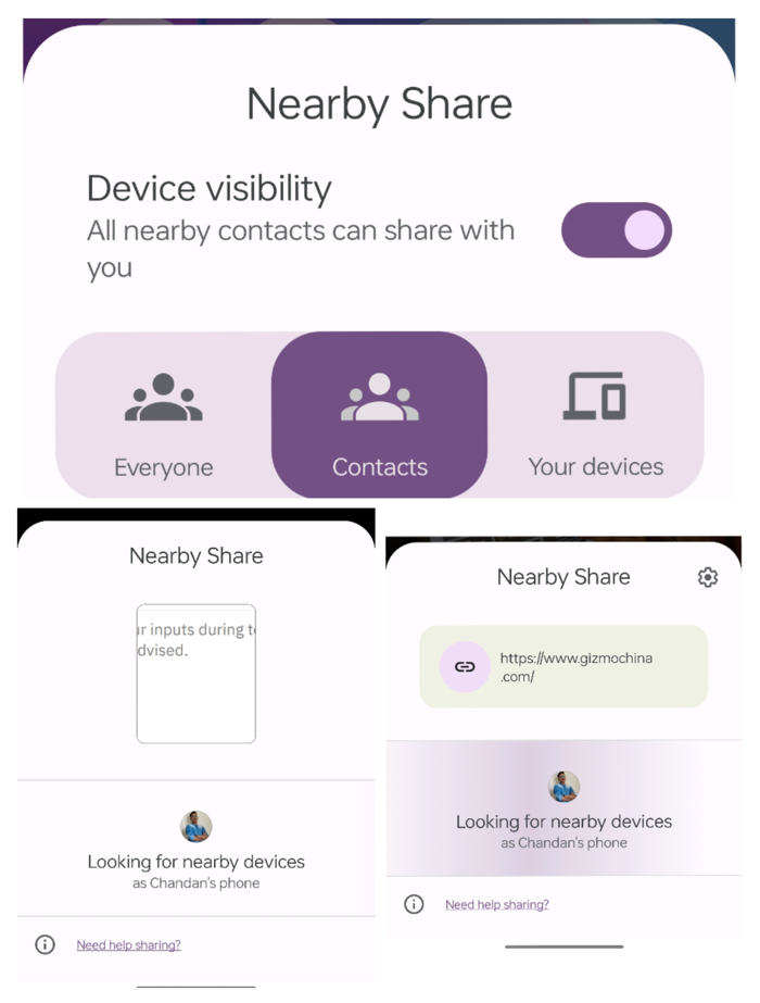
Regarding the improvements, when you start Nearby Shares, a tab slides up to begin “Looking for nearby devices.” Google employed a left-to-right wave in the past to indicate that this was happening. The point was conveyed by a subtle element. Utilizing different Material You forms that expand and then fade out behind your profile avatar, a little Nearby Share redesign will be implemented.
The Nearby Share icon is now visible at the top of this panel, and the text has been made somewhat larger and more central. The share previews have also been improved by Google, which has made them larger and placed them on a card with symbols so that it is easier to see what is being shared. This minor upgrade to Nearby Share that we enabled has not yet been released, but it is intended to do so after a server-side update with the most recent Google Play services.
RELATED
- Google Adds “Suspected Spam Call” Warning To Its Voice Call Screen
- Google Pixel roadmap leaks revealing company’s upcoming phones until 2025
- Google Pixel 7 users complain of glass on rear camera cracking


