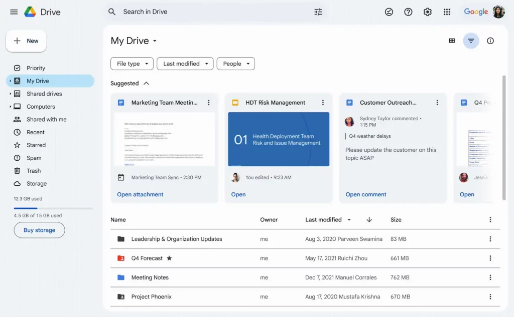
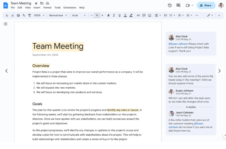
Google has started to roll out the new Material Design 3 user interface (UI) for its Google Drive, Docs, Sheets, and Slides applications. The update aims to simplify the UI, reduce clutter, and enhance collaboration.
The redesigned UI for Google Drive features a white container with rounded corners displaying lists and grids of files. The section headers are more prominent, and line separators have been removed. The new design also includes filters for file types, last modified, and people. The left sidebar features a pill-shaped indicator highlighting the section being viewed, while the elevated “New” button appears just above. Google has added functionality that enables users to hover over a file in the list view to reveal shortcuts to share, download, rename, and open the menu.

The UI of Google Docs, Sheets and Slides now features a pill-shaped toolbar with a light blue background. The suggestions button and comments feature a light blue background, and the top bar features a blue sharing pill and buttons without containers at the right.

The new design rollout will occur over the next 15 days, with all users expected to receive it by March 25th. The update will be available for all Workspace and personal users, as well as for those on the legacy G Suite Basic and Business plans. Google says the redesign will offer a simpler, more streamlined UI emphasizing the most loved tools within the products, helping users work more efficiently with the tools they know and love.
The Material Design 3 UI for Google Drive, Docs, Sheets, and Slides is similar to Gmail’s new look, reflecting Google’s efforts to streamline core collaboration journeys across its products. With this update, Google aims to make it easier for users to collaborate and work more efficiently while maintaining a familiar and easy-to-use interface.
RELATED:
- Google Contacts App Adds “For You” Tab To Remind You of Birthdays
- Android 15’s Dessert-themed Codename Is Apparently ‘Vanilla Ice Cream’
- Google to Release Pixel Buds Series in New Sky Blue Color to Match Pixel 7a
- Mystery Google Pixel Phone spotted at FCC, Could be Pixel 7a
- Google’s New eSIM Transfer Feature To Ease Android Device Upgrades
(Via)


