Meizu is one of the fastest growing Chinese smartphone manufacturers with successful devices like the MX4, MX4 Pro, MX5, M1 Note and M2 Note. The company was established in 2003 and expanded to the smartphone business in 2008 then to a global presence today. MEIZU devices are developed based on a philosophy to make products light in weight but having an elegant user experience with wide screen coupled with easy to use user interface and premium sound quality. Their philosophy was evident from the recent releases in the market.
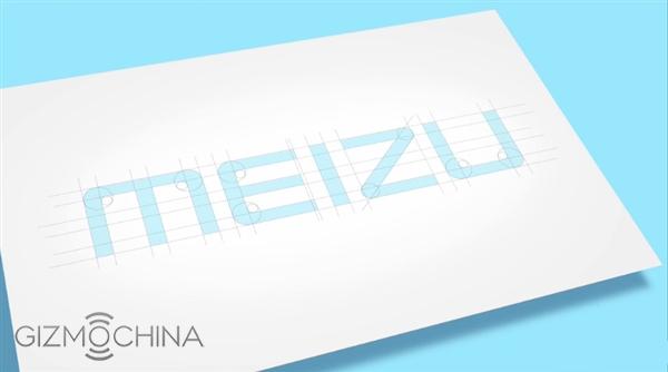
Rumor has been going around that this company was planning to change its logo. And now this has been confirmed and Meizu has unveiled its new logo that will be placed on the new line of devices to be released in the near future. The new logo is designed to read MEIZU in English in light blue color with a unique simple stoke font containing smooth curves around the letters E, Z and U. So, the new logo will be much more linear than the one before, which decreased in thickness as it moved towards the end.
You can check out the video below posted by Huang Zhang for more information.
It looks like the company will debut the new logo today, at the event where it will also unveil the brand new Meizu Pro 5 flagship. The phone is expected to be high-end with great features, so make sure you check back on the website soon for more details.


