It’s been a pretty busy day for Nokia. It looks like the once legendary phone maker is finally making the long-awaited changes. One of them takes place in the identity of the company. Nokia finally created the iconic iconic logo known to everyone. Here are the details…
Nokia changes iconic logo
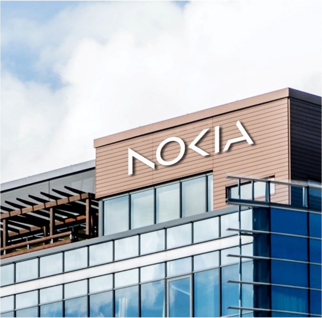
Nokia has unveiled a new brand identity that includes a refreshed logo, as part of its efforts to accelerate growth in the market. This marks the first time in nearly six decades that Nokia has updated its logo. The new logo is made up of five different shapes that form the word “NOKIA”. Unlike the previous blue color scheme, the new logo features a range of colors depending on its intended use.

The shift in Nokia’s branding is reflective of the company’s new focus on the business technology market. CEO Pekka Lundmark explained that the previous association with smartphones is no longer the company’s main priority. “Nowadays we are a business technology company,” he said in an interview with Reuters. Based on this, we can say that the company will not return to the smartphone market.

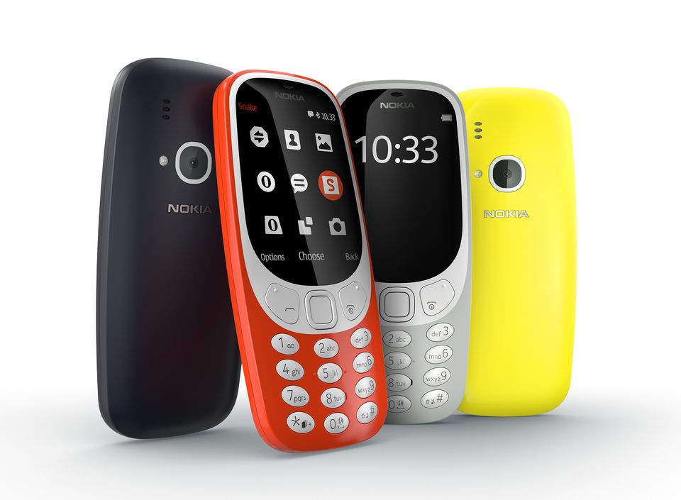
Some of you may think that Nokia is still in the phone market, but that is not true. Phones sold under the Nokia brand are manufactured by HMD Global and the name Nokia is just a brand.
RELATED:
- Hydrogen Fuel Cells: Panasonic’s Answer to Sustainable Energy Need in China
- Putting “Unbreakable” Huawei Kunlun Glass to the Test: The Results May Surprise You (video)
- Nokia Phones Go Local: HMD’s Game-Changing Manufacturing Decision
- Poco C55 Launched in India with 6.71-inch HD+ display, Helio G85, 5,000mAh Battery and More
- HMD Launches Affordable Nokia G22 With a Promise of Repairability


