At Google’s I/O conference, they launched many different products. Among them was an interesting thing called the Android L.
Every time a new version of the Android was launched, Google would talk about its camera specs, processors, etc. In short, they usually put an emphasis on its features. This time, Google talked about its design.
What did this shift in emphasis from features to design mean?
I. It’s not as easy to bring new changes in performance and features
Man’s relationship with cell phones go all the way back to the 90s during the time of black and white phones, but it was not until the release of the iPhone’s iOS, with its touch screen supported functions as well as sensory devices, that this relationship truly changed.
Later, when the Android platform appeared, attempting to copy and improve on the iOS’ strengths such as the desktop.
Over the years, with its many versions, the Android has tried to catch up to the iOS.
Google has added all kinds of personalized features in the Android. Every cell phone manufacturer has scrambled for ideas on how to improve user experience.
Over the last several years, all kinds of excellent third-party apps have been incorporated into the newest Android incarnation. Innovation is no longer difficult, but to actually create new practical features, and not just gimmicky ones, has become very hard. At the same time, the iOS has also studied the Android’s strengths and has also copied the most useful ones. As a result, both the iOS and Android are becoming more and more similar.
It’s no longer possible to be creative with making new apps and features.
II. In the era of homogenization, design is the best competitive strength
Apps and all other kinds of cell phone feature are being gradually homogenized. Third-party softwares are getting homogenized as well. The only way to improve user experience is by focusing on the device’s design.
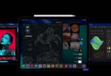
Google’s designs have not been the best, especially the 4.x. Whether it’s the menu bar or icons, the design of Google’s interface cannot compare with the iOS’. This time, they finally dropped the design style used by engineers and have worked painstakingly to design the public version. Improvements have been made on the color scheme, font, and animated transition. These improvements should provide a much better user experience.
III. Challenge on design
For cell phone manufacturers and app developers, new designs mean that they would have to choose the right components all over again.
Cell phone companies will have to look at how to combine their style in designing their own UIs and Apps with Google’s new style. Because of the “flattening” of the iOS, it takes a longer time to develop new Apps. It will only be worse with the path the Android is taking in the way it’s designed.


Comments