When Android co-founder Andy Rubins hinted that his company- Essential will be launching its first smartphone, hopes were high that the device would be a spectacular one. Indeed, when the Essential Phone 1 was announced in May, the design and specs looked promising. But two months after the announcement, the phone is yet to go up on sale. Instead, the company seems to have been dogged by one controversy or the other.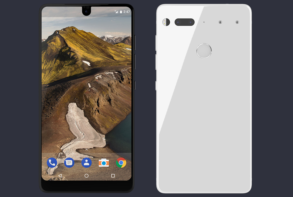
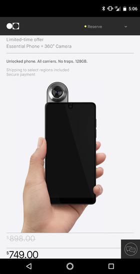
One aspect of the design which has generated discussions is the cutout for the selfie camera which encroaches into the display at the top. We have now got the first screenshot of the Essential phone’s interface showing the status bar and the notification bar which will be by the side of the cutout. What catches our attention the most, is the tall status bar which is said to be 160 pixels long. The length is due to the selfie camera encroachment which has to be made up for since it cuts into the display. The aspect ratio of the device doesn’t make the length of the staus bar look so obvious on the display, anyway.
Related: Essential Phone’s 13 MP RGB + Mono Dual Camera System and its Camera Samples Explained
The screenshot doesn’t look too beautiful but the design, especially the home button looks similar to the Google Pixel design. The not-so-inspiring look of the user interface may not be unconnected with why the Head of UX at Essential threw in the towel recently. The last couple of weeks have seen a number of high profile departures from Essential as well, so it may not be connected. We really can’t make a sound judgement if the UI will be nice or awful until the device is officially launched and we get to see and navigate through the interface live. The device will likely be made available for sale very soon and we are certain it still has interesting potentials, like its own new virtual assistant.
(source)

