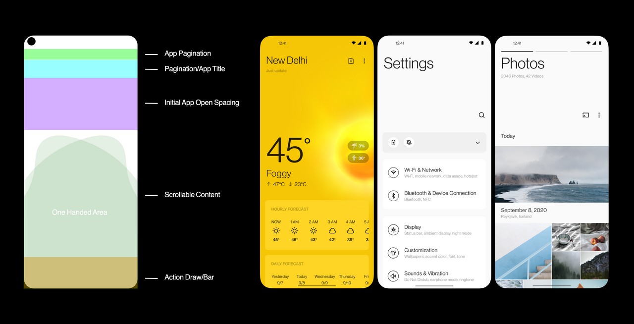
When OnePlus released OxygenOS 11 Beta, the new UI received mixed reviews. There were some who praised the changes and there were others who expressed their displeasure. If you have not seen the new user interface, you can read our hands-on to bring yourself up to speed. OnePlus has now released an official post explaining some of the design changes.
Bigger screens require changes to the UI
Phones are bigger now and manufacturers have to find a way to use the additional space while making the device easier to use. One of the changes OxygenOS 11 brings is the use of headlines in a fashion similar to Samsung’s One UI.

OnePlus says it conducted A/B testing to determine the best size of the headline. A/B testing or split testing involves using two different interfaces at the same time and choosing the one with the best engagement. The result shows 65% of users preferred slightly smaller headlines and 80% of users prefer titles with subtitles. OnePlus says the result is a new headline-body hierarchy that streamlines information delivery in OxygenOS 11.
One-Handed Efficiency
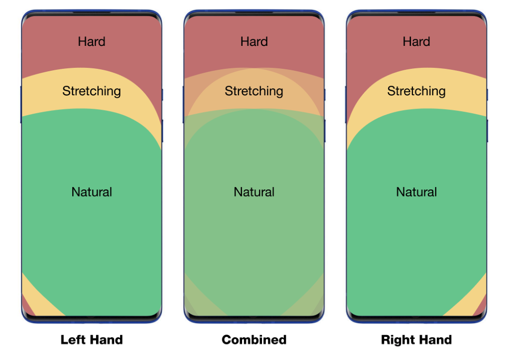
OnePlus reiterates that its aim is to make stock Android better and one of the ways it is doing so with OxygenOS 11 is by optimizing one-handed usage on large displays. The image above is how people use their phones based on the hand they use. The goal is to provide a UI that makes it comfortable to use the device with one hand.

OnePlus says it has done this by moving the touch controls closer to the thumb for easier access as soon as you open a menu. They have also added more features such as a new Quick Share button in the camera app. All you have to do is long-press the thumbnail of the last image you took so you can share the image quickly.
These are some of the reasons behind the design change we have seen in OxygenOS 11. Hopefully, more details will surface when the stable version is launched.
UP NEXT: OnePlus staff reveals OnePlus Nord will not launch in China


Comments