At the end of March this year, Chinese technology giant Xiaomi unveiled its new visual identity that includes a redesigned logo and new typography. Now, the company has started replacing the old logo with the new one at Mi Home Stores.
The development was confirmed by Lu Weibing, Partner at Xiaomi Group, President of Xiaomi China, and General Manager of the Redmi brand. The new logo was revealed by Lei Jun, Founder and CEO of Xiaomi, on 30th March during Spring New Product Launch event.

The new logo of Xiaomi has been designed by Kenya Hara, a professor of Musashino Art University and the President of the Nippon Design Center (NDC).
For this new logo, Xiaomi has gone with rounded corners much like what you have seen on some icon packs. So you have a squircle in place of the old logo which is a square. Xiaomi says the designer used the “superellipse” mathematical formula for the design and had to adjust the variables to get a visually optimal dynamic balance and a perfect balance between a square and a circle.

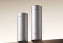
Xiaomi says that it will continue to use orange as its corporate color and thus the color of the logo remains unchanged. However, it will use Black and Silver variants of the logo as supplemental colors for high-end products.
A couple of months ago, in April, when Xiaomi launched its 5000th Mi Home Store in China in the city of Shenyang which was also the first to use the new Xiaomi branding.
RELATED:
- Xiaomi Mi TV 4A 40 Horizon Edition launched in India with an FHD display, outdated Android TV Pie, mere 1GB RAM, and more
- Redmi Note 10 sold over 500,000 units in an hour; Xiaomi generated 1.5 billion yuan within 50 minutes
- Xiaomi introduces 200W wired and 120W wireless HyperCharge technology that fully charges in 8 minutes


Comments